skip to main |
skip to sidebar
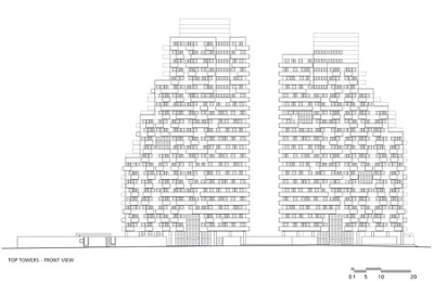
this one of the reasons of why im seriously thinking about moving to some place in south america. Specifically Brazil!ths has been made by the talented brazilian architects Konigsberger and Vannuchi. They are property of Brascan Inmobiliaria in Sao Paulo. Brazil. Pretty much thats the company who put all the money. The proyect is is two towers of 24 and 21 storeys and is situated in the city's financial and commercial centre. Each floor of the tower features a different interior layout, with every office having its own exterior terrace.


 The following is from Konigsberger & Vannucchi:–Top Towers: Formal complexity and constructive simplicitySão Paulo, SPThis project in São Paulo, Brazil, demanded the design of two office towers in a terrain of relatively difficult occupation, because of its narrow and elongated shape.Its location, however, is extremely privileged, situated in the confluence of some of the city’s most important avenues, Paulista Ave., Vergueiro Ave., and Vinte e Três de Maio Ave. The opportunity to design a new building in such a place also represented a great potential for the creation of a new landmark of great visibility in the city’s skyline.Thus, two major guidelines were present at the development of the Top Towers project. The first was a group of typical demands from the real estate market, which included the thorough use of the terrain’s building potential, the optimization of the private areas and the adoption of the best possible relation between private and common areas.The second consisted in the architect’s concern of imbuing the project with great formal richness and impressive plasticity that could achieve the goal of creating a new urban reference.These two relatively conflicting guidelines also needed to be matched through the use of simple and economic constructive techniques, commonly employed by the average building companies in Brazil. This took to the effort of exploring new and innovative applications for common-use, traditional building methods.


 Technical data - Top TowersAuthors: Jorge Königsberger and Gianfranco VannucchiCollaboration: Sandra Dellarole, Huang Kuo Che, Liliane Caparelli, Carla Estrella, Luiz Boscardin and Luiz Paulo EigenheerLocation: São Paulo, BrazilArea of the terrain: 3.802,49 m²Total built area: 25.929,97 m²Total private area: * Tower A: 7422,26 m² * Tower B: 6993,27 m²Number of floors: * Tower A: 24 floors + 3 underground levels * Tower B: 21 floors + 3 underground levelsNumber of units: * Tower A: 217 units * Tower B: 206 unitsNumber of parking spaces: 332Development of the project: 2005 - 2006Building period: 2007 - 2008